meta() API so the Typebot editor can render the right inputs.
Options extends the z.ZodObject<any> schema.
The Forge provide convenient functions to create the options schema for you. Even though you could provide straight Zod schemas, we highly recommend using option functions to create the options schema.
Here is an example of how a schema can be created using the option helpers and meta():
Object
String
Example: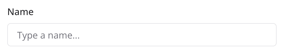
Number
Example: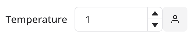
Boolean
Enum
Example: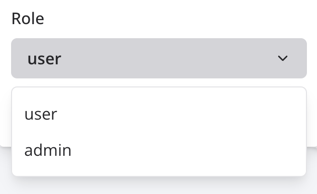
Discriminated unions
Example: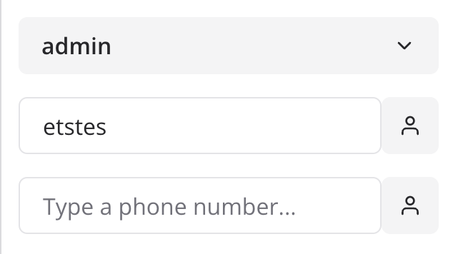
Literal
Used mainly for discriminated unions. It is not visible on the Typebot editor. Example:Array
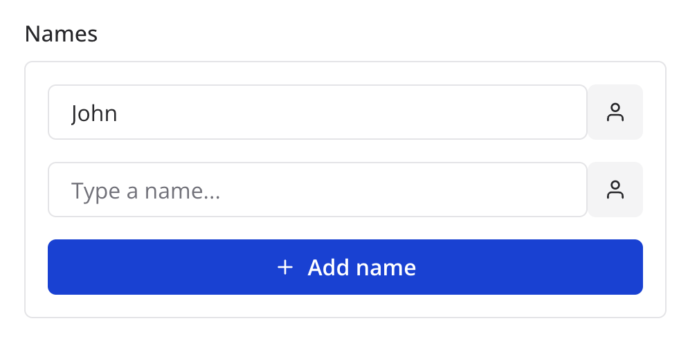
Use this to collect a list of values. Example:-
A list of names
Helpers
Save Response Array
Use this to save the response of an array of options in variables. For example if you want your user to be able to save the response of an HTTP request to variables: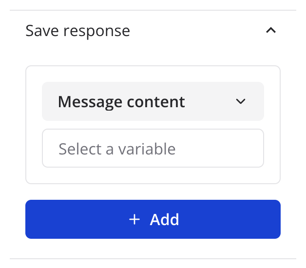
Layout props
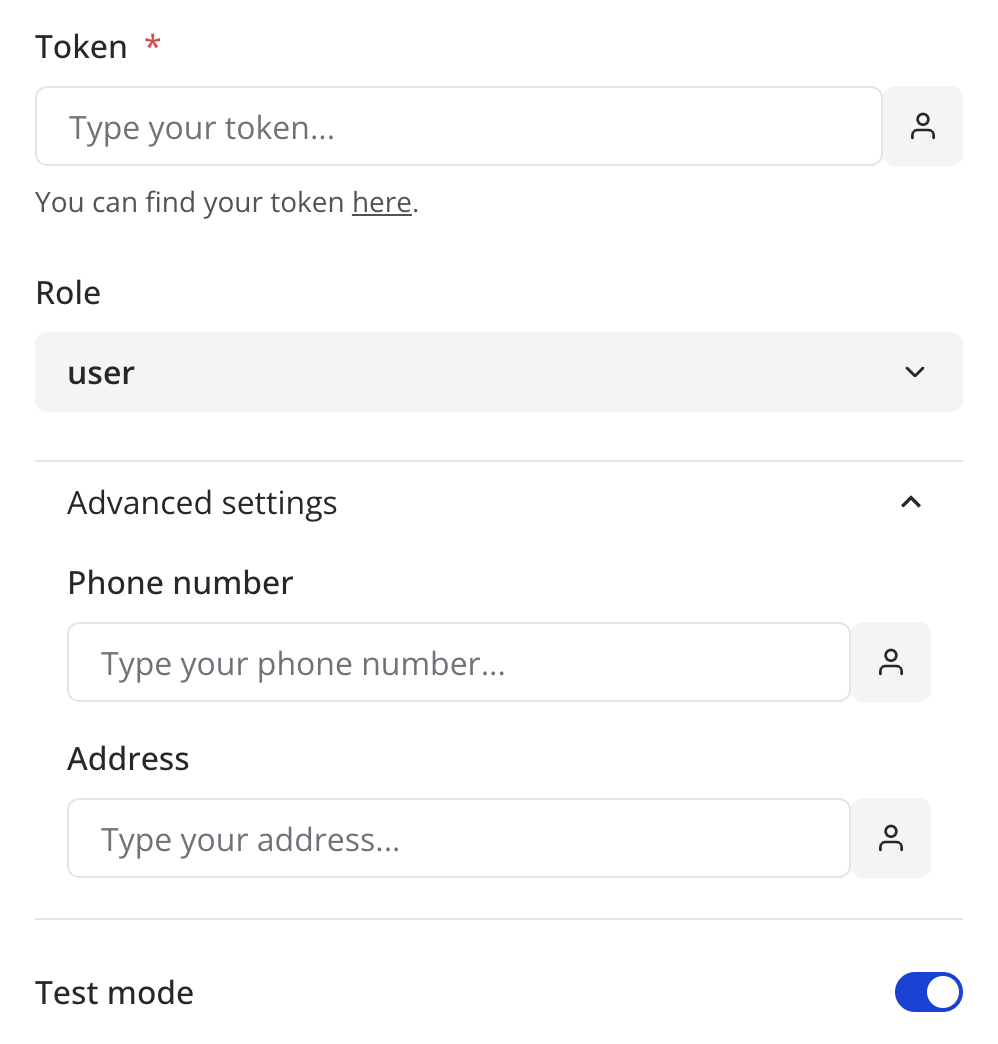
The label of the option. Will often be displayed right above the input.
The placeholder of the input.
The helper text of the input. Will often be displayed below the input.
The name of the accordion where the option will be displayed in. For example if you’d like to group 2 properties in the same accordion named “Advanced settings”, you can write:
The direction of the input. If set to
row, the label will be displayed on
the left of the input.The default value of the input.
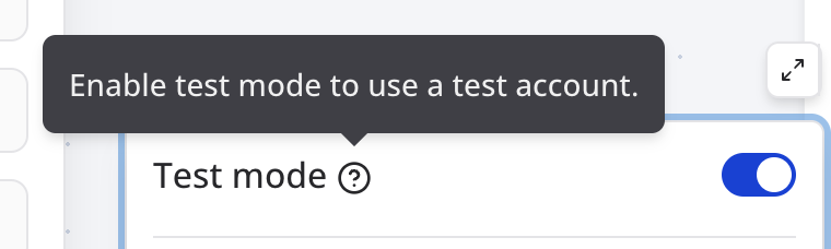
The tooltip that will be displayed when the user hovers the info icon of the
input.
Whether or not to display the variable button next to the input.
The type of the input to display.
Whether or not the input is required. Will display a red star next to the
label if set to
true.Set this if you’d like your input to provide a dropdown of dynamically fetched items.
fetchModels should match the id of the fetcher that you defined in the
fetchers prop of the action. See Fetcher for more information.Array only
The label of the items of an array option. Will be displayed next to the “Add”
label of the add button.
Whether or not the order of the items in an array schema matters. Will display
“plus” buttons above and below when hovering on an item.